About Me

Currenty a second year, studying Graphic Design at the Arts University College Bournemouth (formerly AIB).

Monday 14 December 2009

Max-O-Matic


Ever since Art Foundation i've been really interested in the work of a Graphic Designer in Barcelona called Maximo Tuja. I love how you can see all the texture on the characters and nothing on the background. He's done a whole series of posters and prints which are all based on the things that inspire him, " i don´t know exactly what they are and where they can be found. Inspiration=nonsense?"

Second Year Begins

So its been a good few months since i last updated this, but second year has begun, and first term is almost over. This term has mainly been focused on Visual Systems and Preparation for practice. 
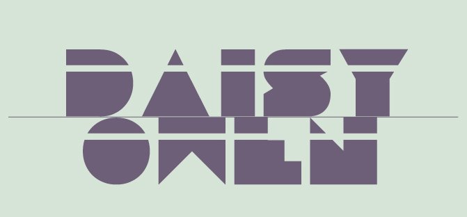
Within Visual systems there were 3 projects, the first laying out and creating a system out of text based on Slumdog Millionaire. I chose only the text that spoke about the film itself, and stayed away from any text talking about the issues and consequences of the film. I just wanted to keep my design clean and simple with no emphasis on poverty etc, as i figured that would be pretty popular. For some reasons its the wrong way round, should be 90 anti clockwise:
I originally had a beige background but it didnt really fit in with keeping everything clean and simple, white was much crisper. For the text i had to rotate each line by 4 degrees. I used a circle text wrap and inverted it, to be able to keep the text exactly in the shape.

Sunday 17 May 2009

The Big Chill Festival


My brother went to the festival last year and if i can get enough money im going to go this year with him, i came across this in the Guardian. Its one of the posters for the festival and it was created by a third year graphic design student from Cardiff called Matt Needle. Again its following the collage style that im determined to get back in to. As much as i love clean cut, simple design, it doesnt inspire me in the same way that the above does. Its all about composition and manipulation.

First year over

So my first years over, which seems pretty scary and daunting. i feel i've learnt alot this year and that my work finally follows a structure when it comes to laying out text and huge amounts of writing. I've also finally learnt how to use illustrator after years of claiming i will over holidays :].
 As much as i've loved this year, it will be good to have longer projects and perhaps experiment a bit more in second. i suppose the first year freshers life has kind of swept me away and there have been a few times at the beggining of the year i put my work below my social life but im hoping ive managed to pass everything! i mihgt of just jinxed that, i suppose i'll find out on wednesday.
 Next years going to be alot more work orientated. something that will be made easier in moving out of halls! it got quite suffocating living where i learn, i think i'll blame that for my nights out. It'll also be brilliant not having to listen to Guys and Dolls or COD at 5 in the morning from the room next door. It all went downhill when my neighbour got massive speakers. 

Eduardo Recif


I've always followed the work of Eduardo Recif, an illustrator who works mainly in collage but also creates some pretty awesome hand-drawn type. In the last couple of weeks he posted some new illustrations, the majority of which encorporated some renaissance paintings. I've always loved his use of papers and his compositions. i think the one above is perhaps my favourite, its called 'bright side' . i love the floral papers, the saturation and the vintage feel it has. 
I think that next year i might go back to collage, and focus more on handmade and detach myself from using adobe software quite so much. 

Saturday 28 March 2009

Magazine Spread


This project introduced us to InDesign, yet again we wernt allowed to use any other programme... Learnt alot about it so it was helpful! We had to choose an article and illustrate and redesign it. I was way to indecisive about what article to use so i ended up opening a random page in the newspaper and using that one ha! it was all about student beauty pageants at Londons top universities.


These are 3 typefaces i had to design... we were set the task of coming up with an appropriate typographic layout for a profession. The first is Clumsy Magician, the second Graphic Design student and the third was Accident Prone Acrobat. These were done when i was just getting to grips with illustrator. We had certain limitations with this project, the first being that we couldn't use photoshop or any other programme other then illustrator, this was to help us get to grips with it quicker.. we were forced to use it and put outside our comfort zone which was actually really good :) The second limitation was that we wernt allowed to use imagery. This rule stayed for the whole of our Typographic Studies project, up until the final project.