

I've just finished a 2 month project in which we were put in groups of 6 or 7 and given a design movement to study and to create an exhibition for... we were asked to write a 5000 word essay between us, create appropriate layouts, covers and generally just turn it into a professional book... it ended up looking pretty good :).
we had to come up with loads of merchandise as well! so we made notebooks and rubbers and tshirts and bookmarks and god knows what else.. nauman got a bit carried away ha.
Simon in our group created this amazing poster which seemed to go down well with our course leader which is always good! we also had to come up with a presentation which is yet to be given yet due to our class all having mumps ha! bad times..
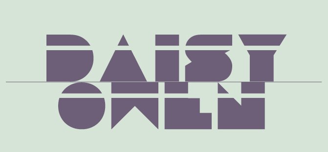
Me and two other girls in my group, Kate and Helen.. had to design and make a model to represent the movement... we must of come up with around 7 designs before both our tutors felt happy with it.. The model above is in Bauhaus 93 font, with text down the front in Universal. when we first got the B's cut there was a fuck up, and the guy in charge of our group got it cut the wrong size and font... we tried to make it anyway but it was a disaster so we had the best moment in the entire project of completely destroying it... it was amazing :) and so we recreated it how we wanted it... in about a day and a bit.. pretty stressful but ended up looking alright!
Everyone else in the class created brilliant campaigns.. they were all so different... particularly liked Art Nouveau and Arts and Crafts... they both looked so professional and really pretty :)
It was a really good project, dragged on a lot! and there was conflict with certain people but for the most part it was pretty fun :) i wish we'd got given a different movement as Bauhaus stood for functionality and everything was pretty simplistic.

 This project introduced us to InDesign, yet again we wernt allowed to use any other programme... Learnt alot about it so it was helpful! We had to choose an article and illustrate and redesign it. I was way to indecisive about what article to use so i ended up opening a random page in the newspaper and using that one ha! it was all about student beauty pageants at Londons top universities.


